There is a cruise week Virtual Card Making Party going on over at the Stars and Stamps blog this week while Sandy and her comrades are on the OWH cruise! (lucky dogs!) This card is for the first challenge VCMP#1 to use hot Tropical colors of pink, green, & yellow. I used a SNSS digi image, coloring with flourescent Copics and used Recollections dsp for the colorful panels. Sentiment is by SNSS.
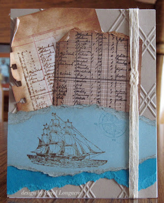
This card is for the VCMP#2 challenge to create a masculine nautical-themed card. I used SU's Open Sea set for this one, adding lots of distress inks, torn panels, an embossed background, and I made a sailor's knot with several strands of crochet thread. Colors are Taken with Teal, Baja Breeze, and Crumb cake, while the manifesto sheets are from the BG kraft and white pads.
There will be two more challenges posted each day until the cruise is over, so grabs your stamps 'n ink and come play along with us! There's lots of prizes to be won, so what are you waiting for? Our soldiers serving overseas would love to have your cards to write home to their loved ones:)
Carol


16 comments:
Great job, Carol! The buttefly is pretty but your second card is stunning... love the torn, distressed panels and that background!
Lovin' those bright bold colors on the first card. And the second card is fabulous. The sailor's knot with the thread is SO COOL!!
You're off to a great start carol. These both turned out terrific. I'm impressed with your "sailors knot" and the distressed aged logs... just stunning!
Carol, that first one is just FUN with all the bright and wonderful colors! So pretty!
And the second one is fantastic. Love all the distressing on here and that knot. Fabulous card for a male.
Lynn
beautiful cards - the butterfly is gorgeous
the nautical with the distressing, the sailor knot- the manifest sheets - two thumbs up
thanks for supporting OWH
Barb Housner
Carol, I've been on the run for two days with company and work. I will try to get to these challenges tomorrow afternoon. Your two cards are terrific. Your first card does fit the challenge. It is so cheery. Your second card is just outstanding. Just looking at it makes me like like I'm on a ship myself. Wonderful cards.
Both are great cards, Carol, Nicely done!
I love both but the second is my favorite! So pretty with the distressed edges.
Gorgeous cards!
OMG, I love that awesome, bright, and cheerful card with the polka dots and beautiful butterfly. I alway love nautical. What a beauty it is, too.
On the first card, I love the pop of black. For the second card, I think the color of the background and its texture really add to the overall design.
I am in awe of that nautical card...totally over the top! PS I like the first card too! TFS!!
The color is just popping out at me on the butterfly card, but I am so drawn to the masculine card, Carol! I finally sorted all of my cards in the closet and realized that I am lacking in the manly department. This has to be one of my very favorite cards you have made.
Oh wow - look at that knot! Amazing how much this string adds the wow factor! Fab job on these cards
Hugs,
JoyceAnn
Love the florescent coloring on the butterfly! Wow, it really pops! Great paper too!
Oh, my! Your nautical card is a stunner too! The sailor's knot is a brilliant touch! Just terrific!
Wow! I love both of them!!! The butterfly card is so vibrant and colorful....with all the nice weather we've had you'd think that butterflies are around the corner. Love the great masculine ship card too!
Post a Comment